ONE – ONE Church, One Prayer, ONE Life.“We believe this is a unique season of opportunity for our church as we seek to impact the Upstate for the glory of God. We are called to this Upstate mission as ONE Church. We share ONE prayer; “God, use us!” And we will each unconditionally devote the ONE life we have to give to leading others to the only One who is the giver of life, our Savior Jesus Christ.” – Upstate Church
Updating the Brand Materials
Every two years, Upstate Church updates their mission statement and I was tasked to update the look and feel of this timeline to reflect on the church’s current initiative.
For the past two years, FB Simpsonville has been following the “ALL IN” initiative. The church had dozens of large scale print banners positioned all around the main campus, which followed its own identity system. My goal was to update all of these large format print materials to the new ONE initiative, which is visually characterized as a clean, sleek, modern aesthetic boasted by blue-white and black colors with blue accents to let you know that this is a modern church.
A key thing to remember is that I did not create the ONE logo and branding. My part in this project was to produce and adapt current wall art to the new initiative branding and make sure files were ready for print.
Below you will see updates to the timeline wall, the wall across from the elevators, and the baptism walls along with a description of the decisions I made updating the designs.
Wall Wrap #1 - The Old
Below is an example of one of the previous materials from the previous initiative. This is the timeline wall. This highlights the key moments in history of this church. Note: this was not designed by me.
The New
Below is the first iteration of the updated timeline with the all new ONE branding.
Milestones in recent years due to the addition of pastors and new campuses called for the timeline to be truncated to allow for more space for new milestones in the future iterations of this timeline with new initiative branding in the future. This truncation also allows for the ONE branding to stand loud and proud on the design. 134 YEARS was made larger and lighter to allow for a better sense of grandiosity in reference to the age of this church.
The jagged edged circle on the right hand side of the timeline was kept from the previous design as an artistic detail that references the Sun, which references today/present.
Unfortunately, the church called for darker imagery.
This is the final iteration of the updated timeline with the all new ONE branding, but in a darker fashion.
This darker theme presented minor challenges to the already established hierarchy within the differing design elements. Because of the darkened background, some elements had too much contrast between each other whereas others had not enough; some minor adjustments were to be made.
The years of milestones stood out too harshly as solid colors, so they were converted to strokes as the color scheme needed to remain somewhat consistent. The gray bars between each decade on the timeline have also been narrowed down and changed to a grey to add contrast between the larger more colorful bars that represent when each decade has passed. The jagged circle representing the Sun has also been changed to a stroke to lessen the visual contrast between the background and the foreground simultaneously. 134 Years has been revised to have even less contrast between the background and the lighter foreground, but still remains visible to bring awareness to the age of this historical church.
Wall Wrap #2 - The Old
Below is the previous wall wrap with the “ALL IN” branding in the area by the elevators.
The New
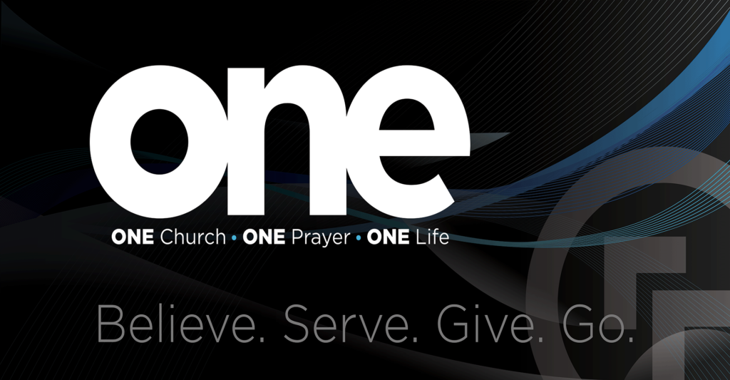
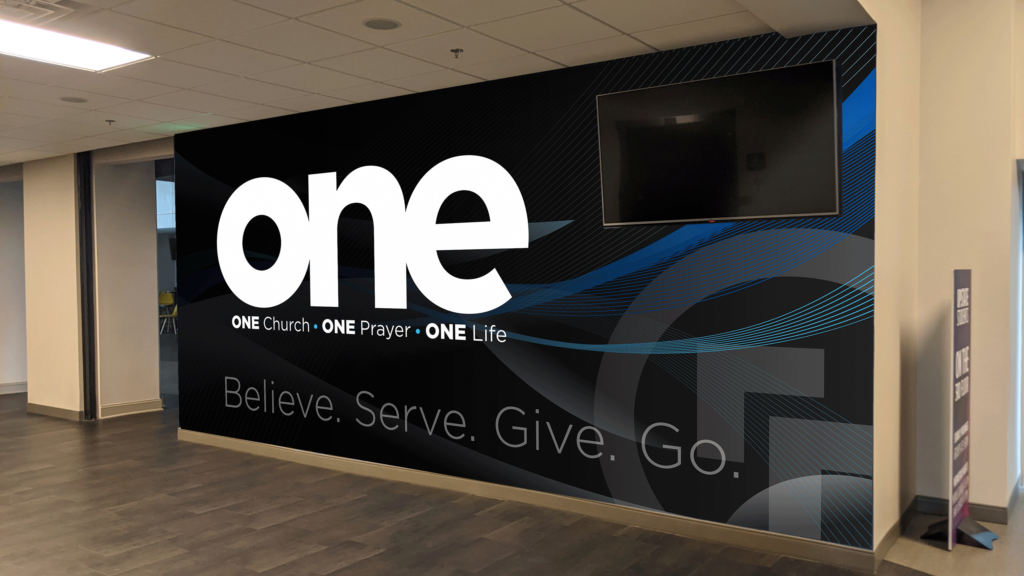
Below is the previous wall wrap with the blacked out ONE branding in the area by the elevators. Space in the top right-hand portion is left as an open space for the TV positioned.
Unfortunately, I don’t have an image with the updated wall wrap. Here is a mockup instead.
Wall Wrap #3 - The Old
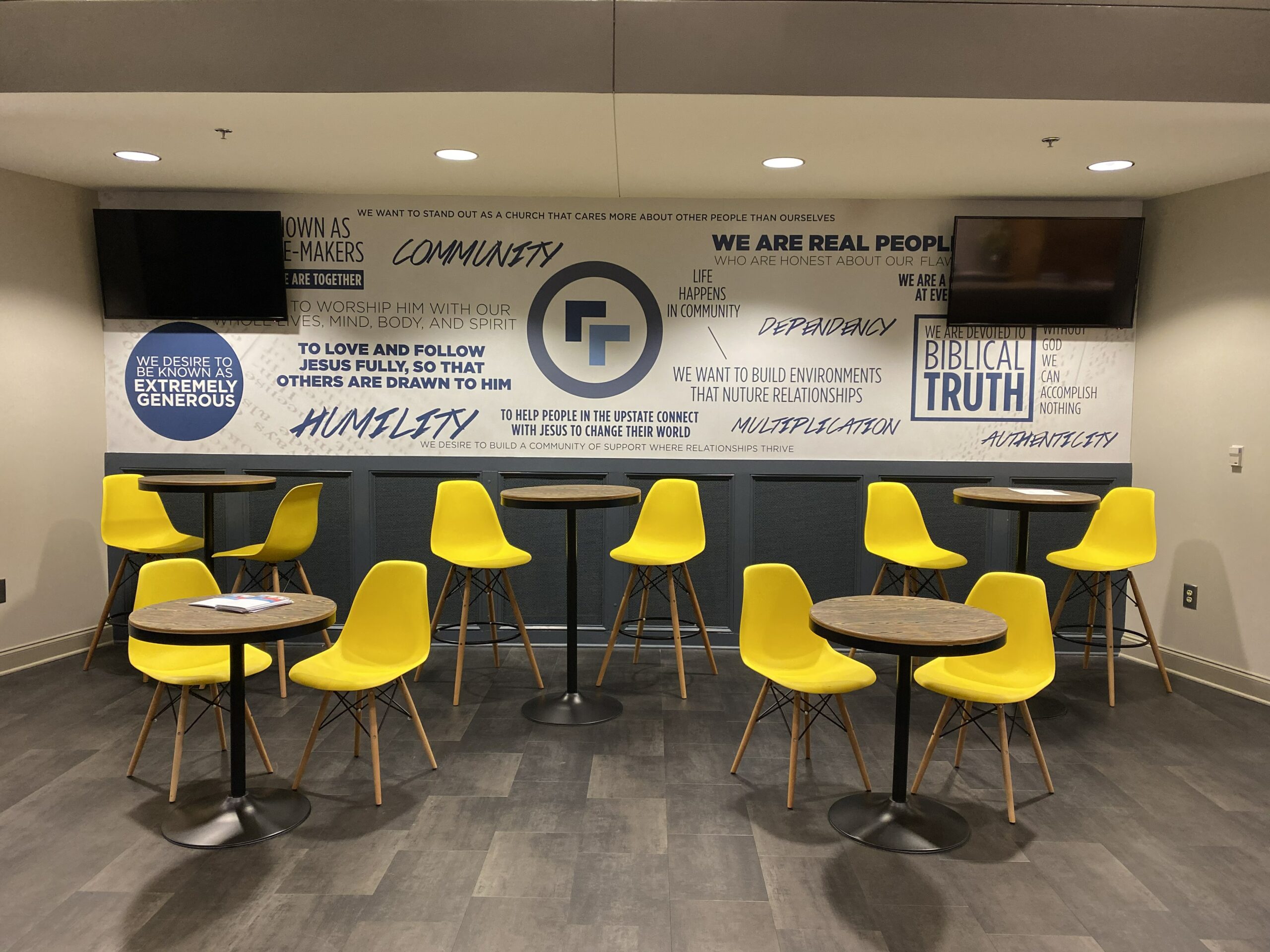
Below is the previous wall wrap with the “ALL IN” branding on one of the baptism wall areas.
The New
Below is the previous wall wrap with the blacked out ONE branding in the area by the elevators. Space in the top right and left-hand portion is left as an open space for the TVs positioned. There are four versions of this same wall wrap on different walls of the church in different sizes.
Take-Aways
The ONE initiative rebranding has so far been my most extensive printing project in 2022; I am writing this mid May 2022.
Projects like these always present a great learning experience. Much was learned of the printing process that hasn’t been disclosed during my years in University. One of the most valuable pieces of information is that default JPEG compression that occurs during PDF exports. This is used as a space saving feature, but can also harm a large format print where it will be viewed from up close because the compression will end up pixelating raster images. This is very noticeable.
And this goes to show that although large format print can be very unforgiving at times, I truly love when the final iteration of the design is up for display. It is truly quite special to see something I’ve created for (up to) thousands to see on a weekly basis.